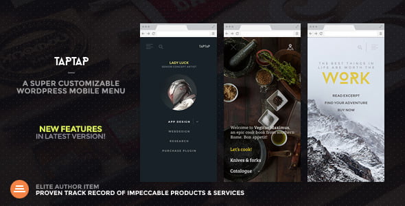
TapTap 5.5 A Super Customizable WordPress Mobile Menu Plugin With Lifetime Upadates.
$3.90
TapTap 5.6 A Super Customizable WordPress Mobile Menu Plugin With Lifetime Updates.
| Features | Values |
|---|---|
| Version | v5.5 |
| Last Update | October 25, 2022 |
| Documentation | Yes |
| All Premium Features | Yes |
| GPL/Nulled | No |
| Instant Installation Support | 24 Hrs. |
| Receive Updates on Email | Yes |
| Website Activation | 25 |
🌟100% Genuine Guarantee And Malware Free Code.
⚡Note: Please Avoid Nulled And GPL WordPress Plugin.
TapTap 5.5 A Super Customizable WordPress Mobile Menu Plugin With Lifetime Updates.
TapTap WordPress Mobile Menu Plugin Features.
TapTap is wildly customizable and by far the most versatile WordPress mobile menu available anywhere. To get acquainted with everything you can edit, add and customize, please have a look at the full details on TapTap’s near-endless possibilities below.
Menu Button
- Position the menu button left or right, then fine-tune top/side distance with per-pixel accuracy
- Open the menu by clicking/tap or by mouseover
- 6 different menu button styles
- Each style has regular and thin variations (12 designs total)
- Each button has two different animations (or no animation at all)
- Set custom animation speed
- Set button opacity
- Customize color, hover color (+ colors when menu active)
- Add label to menu button
- Enter custom label text
- Position the label anywhere around the button with per-pixel accuracy
- Set custom font size
- Set the custom letter spacing
- Select label font (12 options available, or use a theme font)
- If the menu button is hidden, the label will remain visible (if one is entered) and can be used to activate the menu
- Customize label color, hover color
- Optionally hide the menu button (useful if you’d like to use a custom element to activate the menu)
Logo Placement
- Position the logo left, center, or right, then fine-tune top/side distance with per-pixel accuracy
- If the logo is entered as text:
- Set custom font size
- Set the custom letter spacing
- Select logo font (12 options available, or use a theme font)
- Customize color, hover color
- If the logo is entered as an image:
- Set custom logo image size
- Optionally hide logo placement
WooCommerce Cart Button
- Position the WooCommerce button left or right, then fine-tune the top/side distance with per-pixel accuracy
- Cart and shopping bag icon variations
- Customize colors, hover color
Search Button
- Position the search button left or right, then fine-tune the top/side distance with per-pixel accuracy
- Regular and thin search button variations
- Optionally flip the search button for additional variations
- Customize color, hover color
- Add a label to the search button
- Enter custom label text
- Position the label anywhere around the button with per-pixel accuracy
- Set custom font size
- Set the custom letter spacing
- Select label font (12 options available, or use a theme font)
- If the search button is hidden, the label will remain visible (if one is entered) and can be used to activate the search function
- Customize label color, hover color
- Optionally hide the search button (and the function along with it)
Search Function
- Set custom appearance animation speed
- Search field:
- Set custom search field placeholder text
- Customize search field height
- For RTL support, align the search field text to the right
- Hide the ‘clear field’ option
- Set custom font size
- Set the custom letter spacing
- Select label font (12 options available, or use a theme font)
- Change search field background opacity
- Customize colors of the search field background, placeholder, and search text, and close and ‘clear field’ buttons
- Set background overlay opacity and color
Header
- Show/hide header
- Set custom header height
- Change the header background color
- Change header background opacity
- Show/hide header background shadow (+ set shadow strength)
Menu Container, Menu, Widgets, etc.
- General:
- Display menu fly-out as full-screen or set custom width/height
- Height is applicable when a menu is set to animate from the top/bottom.
- Width is applicable when the menu is set to animate from left/right.
- Set the menu to appear by fading in or sliding from left, right, top, or bottom
- Set custom menu appearance speed
- Optionally show submenu when current (have menus open when on current menu item)
- Optionally close the menu after clicking on a menu item (useful on one-page websites)
- Align menu contents left/center/right and top/middle/bottom
- Give content inside the menu container maximum width
- Alter menu contents’ scaling animation (any scaling level, positive or negative, or disable altogether).
- Set custom left, right, top, and bottom padding menu container
- If on a desktop, pressing the ESC button closes the menu and search
- Change menu background overlay color and opacity
- Display menu fly-out as full-screen or set custom width/height
- Background:
- Add a background image or pattern
- Control corner roundness and distance from screen edges
- Change background image positioning
- Change background image opacity
- Change background color
- Change background color opacity
- Create animated, pulsating, or gradient color backgrounds (+ change animation speed)
- Add heading and subheading texts:
- Change fonts (12 options available, or use a theme font)
- Change font sizes
- Change letter spacings
- Change line heights
- Turn heading readers into links
- Add heading image:
- Set maximum size
- Turn the heading image into a link
- Set top and bottom margins
- Accordion menu:
- Build a multi-level menu (no depth limit)
- Add descriptions to single-level menu items
- Set the vertical spacing between menu items and menu descriptions
- Change fonts (12 options available, or use a theme font)
- Change font sizes
- Change letter spacings
- Change line heights
- Change all colors
- All font options can be set individually for top-level and sublevel items as well as menu descriptions
- Add icons to menu items:
- 600+ icons available
- Change icon size (separately for top-level and submenu items)
- Change icon color (separately for top-level and submenu items)
- Customizable styled scrollbar:
- Customize scrollbar colors
- Customize scrollbar thickness
- Customize scrollbar distance from the sides
- Customize scrollbar corner roundness
- Show the scrollbar always or only on mouseover
- If the styled scrollbar is enabled, it will be displayed on the desktop only. On mobile, the device’s native scroll behavior is used.
- Content animation effects (applied to selected content when the menu opens/closes):
- Scaling
- Horizontal/vertical movement
- Opacity
- Blur
- Widget locations:
- Widget locations above as well as below the menu
- Text widget accepts shortcodes
- Select fonts (12 options available, or use a theme font)
- Set custom font sizes
- Set the custom letter spacing
- Set custom line heights
- Change colors (titles, content, links)
- Set font settings individually for widget titles and content
Misc
- Show/hide at specified resolutions (show on mobile and hide on desktop, or vice versa)
- Hide completely on specified posts/pages
- ‘Smart header’ option (header elements slide out of view when the site is scrolled down, and slide back into view when scrolled up).
- Hide theme menu, logo, etc. when TapTap is active, by the class/ID of the theme elements
- Optionally lock the body scroll when the menu opened
- A dozen carefully selected font variations included (or use your theme fonts)
- Open submenus from the arrow indicator or total top-level menu item
- Optionally have TapTap open by default on the front page
- Toggle the menu via a custom element, via an activator class
- Display alternate close menu button. Available options include left/right positioning and position fine-tuning, fixed or absolute positioning, an optional hover animation, and color and thickness settings.
- RTL support
- WordPress multisite compatible
- Absolute/fixed positioning
- Have the logo, search, and header appear above or below the menu
- Optionally don’t load Font Awesome and Line Awesome icon sets (useful if you don’t use icons in your menu or if something in your installation already loads this widely used icon set)
- Optionally disable retina support (in case you don’t make use of the image possibilities in the plugin)
Horizontal Menu
The horizontal menu has its own set of settings that will be developed independently.
- Add section titles
- Change font/icon sizes
- Change all colors
Experimental Image-based Menu
Please note: When made use of, the image-based menu layout can be used both instead of and in addition to the main menu. The image-based menu has its own set of settings that do not apply to the main menu and vice versa.
- Change all colors
- Change corner roundness
- Supports up to nine top-level items and unlimited submenus
- Upload main images and change other settings in the “Image-based Menu” section
🌟100% Genuine Guarantee And Malware Free Code.
⚡Note: Please Avoid Nulled And GPL WordPress Plugin.
Only logged in customers who have purchased this product may leave a review.
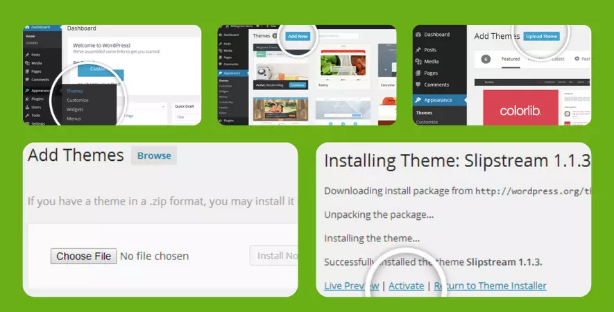
WordPress Theme Installation
- Download the theme zip file after purchase from CodeCountry.net
- Then, log in to your WordPress account and go to Appearance in the menu on the left of the dashboard and select Themes.
On the themes page, select Add New at the top of the page.
After clicking on the Add New button, select the Upload Theme button.
- After selecting Upload Theme, click Choose File. Select the theme .zip folder you've downloaded, then click Install Now.
- After clicking Install, a message will appear that the theme installation was successful. Click Activate to make the theme live on your website.
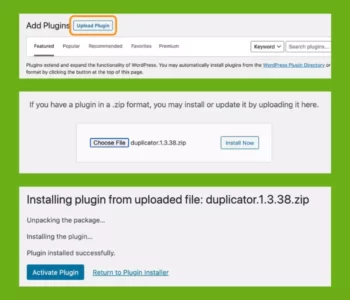
WordPress Plugin Installation
- Download the plugin zip file after purchase from CodeCountry.net
- From your WordPress dashboard, choose Plugins > Add New
Click Upload Plugin at the top of the page.
Click Choose File, locate the plugin .zip file, then click Install Now.
- After the installation is complete, click Activate Plugin.
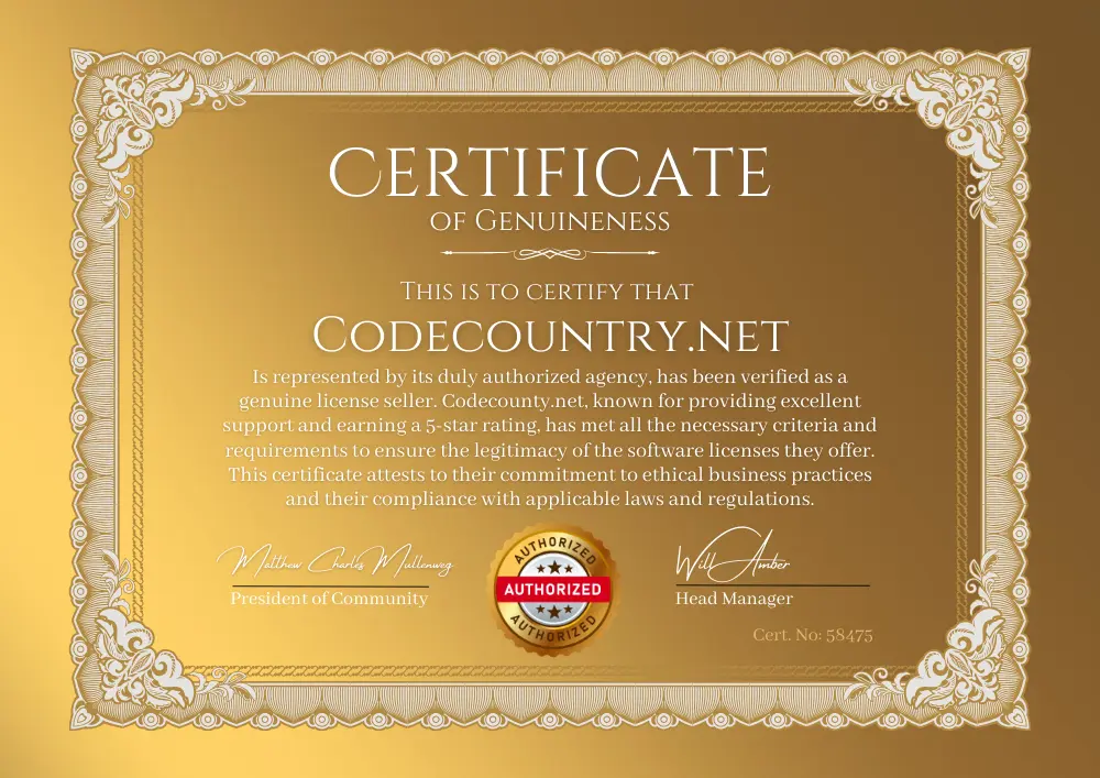
This certificate represents that the codecountry.net is an authorized agency of WordPress themes and plugins.
Changelog
Update 5.5 - Added new website content animation option: next to scaling, opacity and blur controls, you can now also freely slide your website content upon menu open/close (see demo #9 for example) - Added option to unload Google Fonts - Stay tuned for more great updates to TapTap! Update 5.5 - Added a new horizontally opening menu style (please see demo site #9 for a live demo) - Added a brand new icon set (Line Awesome) to easily build your menus with - Updated Font Awesome to latest version !!! PLEASE NOTE !!! Font Awesome v6 icons are entered a bit differently than in the previous versions. Please check the included TapTap documentation for updated instructions on how to enter icons. Or check out and try the newly included secondary icon set for a fresh look!- Reorganized settings (the vertical, image-based and horizontal menus now each have their own section with their own respective settings) Quick update (no version change) - Some JS script and translation string updates Update 5.4 - Added option to open the menu by moving the mouse over the menu button (on touch devices, menu still opens by tapping the menu button even if this option is enabled). Update 5.3 Added options to: - freely customize corner roundess - control menu distance from edges - apply gradient background animation (up to 3 colors) See example #8 on demo site. Update 5.2 - Added customizable WooCommerce cart icon to the header Update 5.1 - Added alternate menu button label option (will be shown when menu is opened) - Added option to apply menu content scaling animation to the menu background as well - Menu item descriptions can now be displayed either above or below menu items - Added appearance animation origin/opacity and spacing options to new experimental layout Update 5.0 - Added new experimental image-based menu design which can be used instead of or in addition to the main dropdown menu. The new menu has its own menu location (TapTap: Image-Based Menu) and customization section in the Customizer (TapTap Plugin > Image-based Menu) - Added optional stand-alone close button (useful in cases where a custom element is used to activate the menu while TapTap's own menu button is hidden)
Previous updates
- added options to apply additional appearance animation to menu items
- added option to display secondary logo when menu is opened (useful if for example you'd like to show a light logo when the menu is closed but a dark one when the menu is opened)
- it is now possible to add a background image to the header (either as full image or pattern), as well as control the background image opacity for see-through effect
- added another widget area; there are now widget areas above as well as below the menu
- added option to hide menu button label when menu opened
Added content animation options. When menu is opened, it is now possible to add and freely adjust the following animation effects for specified site content:
- Scaling
- Opacity
- Blur (done via CSS3, can be disabled for non-touch devices due to possible rendering issues in some versions of Chrome)
- Added option to lock body scroll when menu is opened.
- TapTap is no longer just a full-screen menu; width and height of the menu fly-out can now be customized.
- Added optional 'smart header' option. When enabled, header elements will slide out of view when scrolled down and slide back into view when scrolled up (see example #6 on demo site).
- Added option to hide TapTap on specified posts/pages
- Added option for pulsating background color (view example #5 on demo site)
- Added option to change pulsating background color animation speed
- Added option to change heading image maximum width
- Updated icon set to latest version
- Added optional, heavily customizable styled scrollbar (If enabled, displayed on desktop only. On mobile, the device's native scroll behavior is used)
--- Customize scrollbar colors
--- Customize scrollbar thickness
--- Customize scrollbar distance from the sides
--- Customize scrollbar corner roundness
--- Show the scrollbar always or only on mouseover
- Added scaling options to menu appearance. You can now enter any level of scaling you'd like or disable the scaling animation altogether
- It is now possible to toggle the menu via a custom element, via an activator class (details in the documentation)
- Fixed search overlay issue which appeared on super high resolutions
- You can now preview any changes you make in real-time (settings are under "Appearance → Customize → TapTap Plugin")
- The menu button, logo and search button can now each be individually positioned, allowing you to create any header layout you'd like
- You can now set custom height for the header
- Expanded upon the logo area
--- Customize logo image size
--- If logo is entered as text, select from different fonts (or use a font included in your theme), change font size and letter spacing
- You can now add fully customizable labels to the menu and search buttons
--- Position label anywhere around the button
--- It's also possible to hide either button (label will remain visible if one has been entered)
--- Select label font (or use a theme font), font size, letter spacing
--- Customize colors
--- Optionally hide menu label when menu is opened
- Redesigned menu buttons and re-did button animations
--- There are now 6 different menu button styles
--- Each style has regular and thin options (12 designs total)
--- Each button style has 2 different animation options (or no animation at all)
- Redesigned search icon
--- Search icon now has thin and regular variations
--- Search icon can be flipped for additional variations
- Rebuilt the search function
--- Added 'clear field' option to search field (can be disabled)
--- Height of search field can now be customized
--- Appearance speed of search field is now customizable
--- Opacity of search field is now customizable
--- For RTL support, search field text can be aligned right
--- Change the search field's font (or use a theme font), font size and letter spacing
--- Added overlay when search field open (change color, opacity)
- Rebuilt the submenu indicator arrow
--- Instead of just rotating, the submenu indicator arrow now animates beautifully
--- The arrow and its hit area are now larger for more comfortable use
- Updated retina.js
--- The inclusion now specifically only targets the logo and heading images
--- Added option to disable retina image support
- Added option to show submenu when current (have menus open when on current menu item)
- Added scaling animation to content inside the fullscreen menu
- Added setting to control menu appearance speed
- Added background overlay with customizable color and opacity
- Added options to set top and bottom margin to heading image
- Added option to set maximum width to the content inside the menu container
- Added individual left, right and bottom padding settings to menu container (only top padding setting existed previously)
- Submenu items and menu descriptions now have their own letter spacing options (instead of inheriting it from top-level menu items)
- Widened font selection to a dozen
- Pressing ESC button now also closes search
- The submenu indicator arrow divider is now shown and hidden automatically depending on whether the "Alternate submenu activation" option is active or not (this setting chooses if a submenu is triggered by the entire menu item or the arrow indicator only)
- Updated how GoogleFonts are enqueued
- Updated FontAwesome icon set to latest version
- Updated retina.js inclusion
- added retina logo support
- added option to show shadow behind header (+ option to customize the shadow strength)
- added new menu button, search button and logo positioning options (Upon customer requests, logo can now be centered and menu and search buttons can individually appear on either left or right sides)
- added 2 new menu button styles
- users can now control menu button animation speed
- added option to use full top-level menu item (text + arrow icon) to open sub-menus, instead of just the arrow icon
- updated icon set to latest version
- added widget location (with customizable options+colors, text widget accepts shortcodes)
- added option to turn heading image into a link (+option to open in new window/tab)
- added option to display header and search when menu is open (by default they get hidden behind the full-screen menu)
- added option to change menu contents' top distance
- updated icon set to latest version
- the default "type search term.." text can now be customized
- added advanced feature: theme menu can now be hidden when TapTap is active, given that the user knows the class/ID of the theme menu
- removed empty space from bottom of the screen that could momentarily appear when scrolling on certain touch device browsers
- changing vertical align for sub-menus now plays with bottom margin instead of top margin, making for a more consistent overall appearance
- added option to open the menu by default on the front page
- colors for active menu item can now be customized
- Added a third menu button style (static SVG)
- 500+ icons can now be added to menu (colors+size adjustments also available)
- Added option to close menu when menu item is clicked/tapped (useful on one-page websites where menu links lead to anchors instead of new pages).
- Added option to customize menu button hover color when menu is active
- Heading and sub-heading texts can now optionally be turned into links
- Added options to customize line heights for heading and sub-heading (useful when your (sub-)heading text spans multiple lines)
- Added second menu button style (a more traditional, three-bar hamburger menu)
- Added option to change active menu button color
- Menu and sub-menu item font sizes and line heights can now be changed separately
- You can now add customizable descriptions to single-level menu items (documentation updated accordingly)
- Added quick links to settings page for easier navigation
- Added search feature (optional)
- Added positioning options for background image
- menu can now be closed by pressing the ESC key







Reviews
There are no reviews yet.